| Price | to push/fall |
| open p. | to move up (down) |
| high | to go |
| low p. | to trend up (down) |
| close p. | rally to |
| watched p. | to climax |
| subsequent p. | to peak |
| lower p. | go sideway |
| higher p. | to retrace 50% |
| price target | to shift from down trend to up trend |
| to gain control | |
| to regain | |
| to rise on strong volume | |
| to bounce off the support line | |
| to turn down | |
| to climb back but fail | |
| to close to... | |
| to close below... | |
| to settle below... | |
| Volume | to increase |
| lowv. | to decrease |
| high v. | to fall |
| strong v. | to rise |
| weak v. | to decline |
| declining v. |
Ex. 2 Translate the dialogue from English into Russian in writing and from Russian into English orally.
Dialogue
1. What do trend lines indicate? Trend lines indicate trend direction
2. What does a trend line join?
To draw a trend line you must join two extremes that are consecutive (and of similar magnitude).
3. In what case is a trend line not valid?
A trend line must not cut across any other price data — else it is not a valid trend line. A trend line should not be drawn just anywhere.

4. How is an upward trend line drawn?
Graphically, an upward trend line is drawn up toward the top right hand side of the Y-scale.
5. How can you idetify up trends?
There are two ways to identify up trends: look for higher highs and higher lows. Look for extreme pivot points. When joining points to produce a trend line in an upward trending market, you join the low points.
6. What does a climax followed by a retest signified? The end of a trend is usually signified by a climax (peak) followed by a retest of one of the extremes (either the high or the low) whilst it is in the ranging stage. Usually the test is of the low if the trend is moving towards a down trend and on the high if the trend is moving upward.
7. How many points does a down trend require?
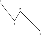
• A down trend requires a minimum of four points.
• It needs a lower low (from I to 3) and a lower high (from O to 2).
8. How is a market sideways trend drawn?

• A sideways market requires two extreme points — in this instance A and B.
• To confirm a sideways market there must be a retest of
one of these extreme points (in this instance the retest is
of the low point C).
9. How many highs does an up trend require?
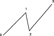
• An up trend requires a minimum of four points.
• It needs a higher low (from 0 to 2) and a higher high (from 1 to 3).
10. What trend indicators do you know?
Tools that can be used to indicate a trend include:
Trend lines, Moving Averages
11. What trend characteristics are identified by price patterns?
Patterns are used to identify the following characteristics about trends:
1. Trend Identification
2. Trend Reversals
3. Trend Continuation
Trend lines are used to determine what type of trend is in force. General theory is, once a trend line is penetrated, it is a signal for consolidating market — in other words it is time for a sideways movement and not an immediate buy or sell signal as often thought.
Ex. 3. Put questions to the underlined words.
Ex. 4. Read and translate the text.
TRANSLATION PRACTICE
THE SIGNIFICANCE OF TRENDLINE ANALYSIS
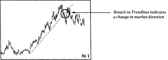
| The misused Trendlines are one of the simplest and most useful indicators in Technical Analysis. They also happen to be one of the most misused. "One of the biggest mistakes made by beginners and professionals alike, is inconsistently defining and drawing the trendline. To be useful, the trendline must accurately reflect the definition of the trend." (Victor Sperandeo) The Classic Trendline Like manv other Technical Analyses, trendline analysis is considered an "art" rather than an exact science. This does not mean. however, that a trendline can be drawn "iust anvwhere". Certain conditions must be followed in order to enforce the usefulness of this tool. We will discuss some of the standards maintained by trendline users in the market place today and look at the means of determining where and how trendlines should be drawn. A trendline requires you to ioin three price extremes. This means you need to join three low points when the market is in an up-trend or three high points when it is in a down-trend. Joining less than three points — for instance, joining two, indicates a tentative trendline that mav become valid but still requires confirmation from future price action. When ioinine the three price extremes, the trendline must not cut across any other price data — otherwise it is not a valid trendline. Trendline Signals Having drawn the trendline. vou are then able to derive three essential clues. If prices breach the trendline this indicates a change in the rate at which the market is changing direction. It also indicates that the market may not continue in the same direction it had in the past. However, it does not indicate an immediate change from an up-trend to a down-trend, as many tend to think. It points instead to a change from the existing up or down trend to a sideways trend or a congested market. If any part of the trendline is breached, that trendline should be redrawn or else considered invalid. (See Diagram 1) The steeper the trendline, the less likely it is that the trend will hold. Manv traders use the principle that the steepness of | Vocabulary i significance — значение i.misused — используемый неправильно inconsistant — непоследовательный, противоречивый э: enforce — реализовать i: extreme — крайняя точка | |
| е 'tentative - условный, требующий подтверждения ai to derive — получать, извещать и: 'clue - ключ (информация) к решению проблем | ||
| the trendline should be 45 degress — but this is a subjective view derived primarily from the work of Gann. Trend channels are often drawn bv traders to identify areas that are overbought (up-trends) or oversold (down-trends). | as 'magnitude | — величина |
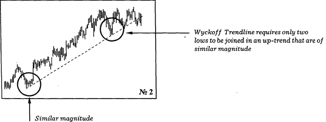
| The Wyckoff Trendline The principles and conditions that make up the "classical trendline" are in many respects a variation of Wyckoffs original findings on this subject. Wyckoff included the following conditions: Firstly, he argued that a trendline requires you to join only two price extremes as opposed to three. He qualified this by specifying that the two price extremes had to be consecutive and of similar magnitude. {See Diagram 2) This condition of similar magnitude to validate a trendline is now disregarded by most traders using the Classic Trendline conditions. It is however, an important measure of the change in trend. For instance, if a Wyckoff trendline is breached, the concept of similar magnitude indicates the degree of the change in trend of that particular time frame. | I 0: to disregard — не принимать во внимание | ||||||
| л to recover | - восстанавливать | ||||||
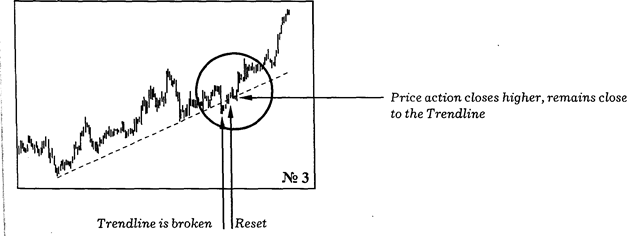
| A second concept included by Wyckoff in his analysis of trendlines, was the idea of a trendline that is "recovered". In other words, the concept that a breach of a trendline does not always automatically render that trendline invalid. Diagram 4 provides us with a great example of this. Market prices break this trendline but then continue to close consecutively higher and closer toward the trendline. Eventually prices break back above the trendline, retest the trendline and then continue up in the direction of the original trend. (See Diagram 3) Trendlines are one of the most popular tools used to analyse prince action in trending markets. They alert you to changes in market direction and provide you with the valuable signals to buy and sell. The information they give you can be interpreted in an infinite number of ways, but armed with the basis principles, you can work effectively with this analysis and eventually add your own personal touch. | e eventually | — в конце концов | |||||
| л touch | — свое отношение | ||||||
Exercises
Ex. 1. Put questions to the underlined words.
Ex. 2. Select sentences which present difficulties for translation and make a syntactical analysis of them.
Ex. 3. Read and translate the text.
Ex. 4. Enact an imaginery dialogue between the author and a dealer. Make the most of the text.

TECHNICAL ANALYSIS CHARTS
| Types of Charts The interpretation of price action and forecasting in Technical Analysis can be done by using, a number of different charts, seperately or in conjunction with one another as each has its own characteristics and advantages. | Vocabulary line chart - линейный график |
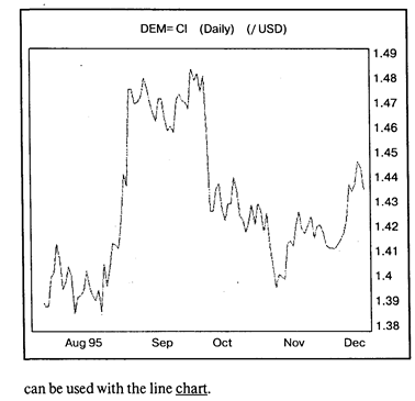
| The Line chart The closing prices are joined to form a line chart. The latter is useful as closing prices are seen as a very important indicator of the trend. The line chart is also a clear diagram as the direction can be identified at first glance. Traditional technical techniques such as trendlines, moving averages and momentum | э: ei interpretation — толкование э: to forecast - прогнозировать |
| d3A in conjunction | — совместно |
| 0: advantage | - преимущество |
| to join | — соединять |
| э a: at 'first 'glance | — с первого взгляда |
| Bar Chart | - график отрезков (гистограмма) |
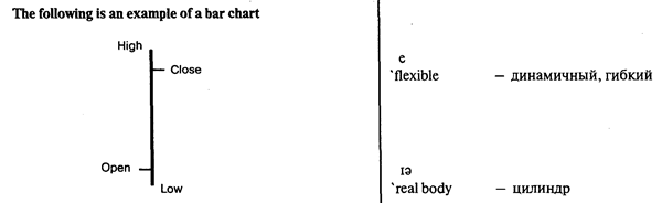
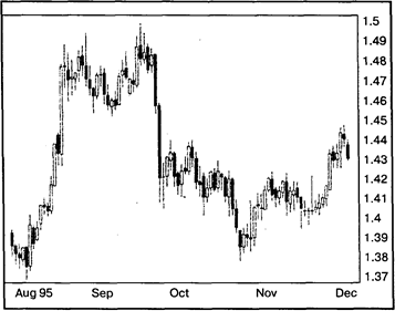
| Bar Chart Bar Charts collect and represent price information on a vertical bar. The top of the bar is the highest price and the bottom of the bar the lowest. A tick on the left-hand side of the bar denotes the open price and a tick on the right-hand side is the close price. A HiLo Bar Chart is a vertical line that represent the High and Low prices for an interval. These charts are particularly | tick e 'Elliottwave | — метка — волна Эллиота |
| popular with Elliott wave analysts, where the only necessary information are the highs and lows. The type of chart used by analysts, always comes down to individual preference. The popularity of the bar chart is due to: Ø Clear representation of data. Ø Clear understanding of the relationship between the Open and Close (tells you the result of the war between the buyers and the sellers). Ø Can be used with all other types of analysis. | ae 'Candlestick Chart to assign | — график японская свечка — — - называть |
| Candlestick Charts As with Bar charts, Candlestick Charts use Open, High, Low and Close price data. The major difference is, that if the close is below the open, that is, if the value of the security has fallen, then the bar is coloured in black. If the Close is higher than the Open, the Bar is left clear or white. These charts are very popular among the Japanese who have assigned various names to the different coloured patterns such as hanging man, hammer and morning star. They are flexible (used on their own or combined with analysis tools). Rises and falls in the market are easy to indentify because of the colour scheme. Small candle reflects that buyers and sellers are almost equally placed. The real body represents the range between the intervals open and close. The thin lines at the top and bottom of the real body are called shadows. They represent the interval's high and low. | (black) coloured body — закрашенный цилиндр high (low) shadow — с верхней (нижней) тенью ai 'white body - полый цилиндр |

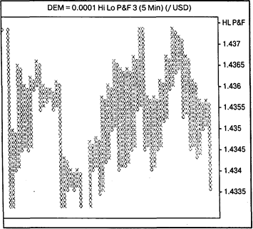
| Point and Figure Charts Point and Figure charts are a study of pure price movement with no indication of time or volume trading. This chart filters out insignificant price movements and plots only the rises and falls in market values. A column of "X" denotes rising prices and a column of'0's falling prices. | 'Point and Figure Chart — график крестиков и роликов |
| Later columns are displayed to the right of previous columns. X's are only added to a column ofX's if the high is at least one unit higher than the previous X displayed, 0's similarly are only added when the low is at least one unit below the previous 0 displayed. If the current column is a column ofXs, a reversal or a new column of Os will take place only if no new Xs are added to the current interval (that is only if the high price is not higher than the previous high) and the low is at least the reversal number of box sizes below the value represented by the last X displayed. Point and Figure charts provide very strict rules on how to buy and sell: | to plot - отмечать later columns — (последующие по времени колонки э: reversal — перемена направления |
| >• Buy at the Break of a triple top. >• Sell at the Break of a triple bottom. These charts are particularly useful in a trending market because they keep you in the market. However, in a ranging market, these charts chop you around. A Horizontal Count of the Xs or Os is used for showing a direct link between the width of congestion and the size of the break out from that congestion. For estimating the next high or | to chop around — путать e to 'estimate — рассчитывать, оценивать |

| Point and Figure Charts Point and Figure charts are a study of pure price movement with no indication of time or volume trading. This chart filters out insignificant price movements and plots only the rises and falls in market values. A column of "X" denotes rising prices and a column of'0's falling prices. Later columns are displayed to the right of previous columns. X's are only added to a column ofX's if the high is at least one unit higher than the previous X displayed, 0's similarly are only added when the low is at least one unit below the previous 0 displayed. If the current column is a column ofXs, a reversal or a new column of Os will take place only if no new Xs are added to the current interval (that is only if the high price is not higher than the previous high) and the low is at least the reversal number of box sizes below the value represented by the last X displayed. Point and Figure charts provide very strict rules on how to buy and sell: | 'Point and Figure Chart — график крестиков и ноликов | |||
| to plot - отмечать later columns — (последующие по времени колонки э: reversal — перемена направления | ||||
| Ø Buy at the Break of a triple top. Ø Sell at the Break of a triple bottom. These charts are particularly useful in a trending market because they keep you in the market. However, in a ranging market, these charts chop you around. A Horizontal Count of the Xs or Os is used for showing a direct link between the width of congestion and the size of the break out from that congestion. For estimating the next high or | to chop around — путать e to 'estimate — рассчитывать, оценивать | |||
| low target, after a consolidation phase you must take the largest (the most) Xs or Os in one horizontal line (usually near the middle). Multiply the number of boxes in this line by the size of the reversal, then add this number to the point where the break out occurs. The Vertical Count, the count from top to bottom, is a measure of volatility. One must measure the beginning of the break out to when congestion begins then. > multiply the number of boxes in this line by the reversal size and. >• add this to the point where the next break out occurs. | target break out to occur | — контрольная плановая цифра предполагаемая цена — точка прорыва — случаться |
Exercises
Ex. I. Put questions to the underlined words.
Ex. 2. Read the text and translate it.
Ex. 3. Discuss the pros and cons of the bar types of charts.

TECHNICAL ANALYSIS PATTERNS
| Price Information: Open-High-Low-Close-OHLC To accurately read the market, you only need four pieces of information: the Open, the High, the Low and the Close Price. | Vocabulary e to reflect — рассматривать | |||||||
| The Open Price This is the price at which the first trade for the day takes place. Both buyers and sellers have had time to reflect upon the markets close on the previous day. Their perceptions will affect whether the stock opens higher or lower the next day. The subsequent price holds the clue as to which side of the market is the more dominant force — the buyers or the sellers. The High Price This refers to the highest price at which the security has traded that day. It is at this point that buyers decide not to push the price up any higher or alternatively, when sellers have gained control. If the high is at or near the opening of the day, that is a sign that the sellers have been the dominant force. If the high occurs near the end of the trading session and the open was near the low of the day, the buyers have had control. | u: 'clue — ответ | |||||||
| Э: to occur to gain control | — случаться — устанавливать контроль | |||||||
| The Low Price | ||||||||
| This refers to the lowest price at which the security has | ||||||||
| traded that day. At this point the sellers have decided not to accept a lower price or alternatively, when buyers have gained or regained control of the market. If the low is near the opening of that day, that is a sign that the buyers have been the dominant force. If the low is near the close of the day, that is a sign that the sellers are keen to sell and that therefore they have been in control. The Close Price The close is also sometimes called the sentiment. It is the price at which the security is trading at the end of the day. This is the most watched price in analysis as it is seen as the final judgement on who won the day between the buyers and the sellers. If the close is at or near the high of the day and the opening was near the low, it points toward a day of buying. An intra day chart would also reveal that prices were probably in an upward trending mode all day. If the close is halfway between the high and low irrespective of the open, that is interpreted as the market being evenly divided. That is, that the buying power was balanced by the selling pressure. | to be keen | — быть заинтересованным | ||||||
| e | ||||||||
| 'sentiment | — настроение | |||||||
| to win the day | — добиться победы | |||||||
| l | ||||||||
| 'irrespective of | — независимо от | |||||||
Price Patterns
Whether the market is ranging or trending, price movements are not always smooth. As a result price pattern identification is used to determine whether a market trend is intact or whether there exists the possibility of a reversal.
On the basis of chart formations significance to the current trend of the currency they fall into two categories: reversal patterns and continuation patterns.
Reversal patterns
A prerequisite for any reversal pattern is the presence of a trend.
Reversal patterns are often accompanied by a break in the trend line or pivot point. (The larger the pattern, the greater the significance.)
Head and Shoulders Reversal Pattern
The Head and Shoulders pattern is one of the most popular patterns but also one of the most difficult to identify. This pattern derives its name from its formation — which resembles a person. A true head and shoulders pattern will have the left and right shoulders roughly at the same height and distance from the head. The neckline should be almost level.
Head Голова
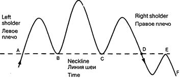
| Before A the neckline was a resistance line. Once it was broken the resistance line turned into a support line. At points В and С the price bounced off it twice. The neckline was broken in point D and the trend reversed. A retest took place at point E. The neckline was a resistance line again. The resistance point held, and the price declined to the level of F, the price target of the head and shoulders formation. In an uptrend Left Shoulder represents a correction. If it takes place — traders may take profits. Trend is still intact. The Head indicates: that prices move up and surpass the high of the left shoulder (Climax), but then move down again. This places the upward trend in question. Rieht Shoulder represents a retest. Buvers re-emerge and price starts to go up again. If price moves up to the same level of the left shoulder or if it retraces 50% from the Head to the ootential neckline — the rieht shoulder is complete. It is an indication that a down trend is in place. There are various analysis regarding the role volume plays with Head and Shoulder patterns. In an uptrend some maintain that the left shoulder carries the hiehest volume, that volume, decreases at the Head and then falls substantially by the right shoulder. Others maintain that the volume is highes at the Head and has a greater decline in the right shoulder. When the market moves out of a Head and Shoulders pattern to the upside, it must have high volume. | ||
| au | ||
| to 'bounce off - | - отскакивать | |
| a. | ||
| 'target | - цель, точка движения цены | |
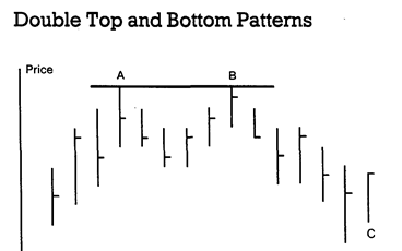
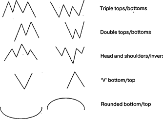
| Time Double tops and bottoms are more common than (but not as significant as) triple tops and bottoms. A double top is referred to as an M, while a double bottom is termed a W. Double top and double bottom patterns are fairly common on price charts, but are often ovemsed. In a double top, a new high is set on strong volume, then volume subsides as prices decline. On the ensuing rally, prices climb back to the first high, but fail to close above this level, and prices begin to fall again. (C) At this point, there is only a potential double top. It is not confirmed until prices close below the first low, usually on strong volume. | sju: ensuing — следующий i: to exceed — превышать u: 'crucial — решающий, важный ei prevailing — господствующий |
After a settlement under this low has been recorded, prices should continue to move a distance equal to the height from the original high to the first low. The same is true for double bottoms, but in the opposite direction. A variation of this pattern is the triple top (and triple bottom). This begins like the double top, but instead of the second correction breaking the first low, prices rally from this point back to the original high. Then, on the third correction, if prices close below the two previous lows, the pattern is complete. The measuring objective is identical to the double top. These patterns often occur at major tops and bottoms, and often exceed the original target by a substantial amount. It is cmcial, though, to wait until prices settle below the first low. Clearly, a breach of the highs in a potential top, or the lows in a potential bottom will leave this looking like a breakout in the direction of the prevailing trend, and rectangle/ consolidation area breakout would be in action, potentially a flag as well.