1. Your visual aids must be large enough for everyone to see.
2. Keep charts, maps and graphs very simple. Don't try to show too many details in one visual aid. Let your visuals speak for themselves. A good visual is like a good newspaper headline-it should make people want to find out more.
3. Do not pass out objects or papers during your speech. If people are looking at objects or reading papers, they will not be listening to what you are saying.
4. When describing very detailed visual aids don't quote precise figures. Give approximate figures and point out the overall trends and developments. Include precise figures and detailed descriptions in a handout or report given out before or after your talk.
5. Look at your audience – not at your visual aids. When you are showing
a picture, graph, etc., be sure to maintain eye contact with your listeners.
6. Never compete with your visuals. When showing a visual, keep quiet and give people time to take it in, then make brief comments only.
7. When you've finished using your visual aids, put them away or switch off your projector.
8. If you are giving a presentation with Power Point or something of that nature, make the information on your screen very simple. The rules of presentation are the same all the time. Five words per line, five lines per slide, five slides per presentation is the target.
Using PowerPoint
Computers make it remarkably easy to produce impressive overheads, usually using PowerPoint. It offers a number of significant advantages, particularly professional appearance, and flexibility. You can revise your presentation at
the last minute, and easily tailor it to a particular audience. You can incorporate relevant tables and graphics. If you are carrying your laptop anyway you do not need to carry anything additional. PowerPoint is a tool you can use to communicate your ideas effectively through visual aids that look professionally designed yet are easy to make. You can produce slides for your presentation and room for notes, at the press of a button print audience handouts, print an outline. These advantages are clear. There are less obvious, but perhaps more serious, hazards with PowerPoint. The ease of generating slides on a computer leads some presenters to use far too many slides so that their audience retains nothing but a blurred impression of an endless series of visuals which they have had no time to absorb. Now that everyone can use PowerPoint, being expert in its use is less impressive than once it might have been. Remember that you are trying to communicate effectively. Be selective and use slides when you need to.
Comprehension of visual presentations
Here we will consider tables, mindmaps, and four different kinds of diagram: pie charts, bar charts, Gantt charts, flow charts and graphs.
a) Tables
A collection of figures can often best be communicated by means of tables (Fig. 7).
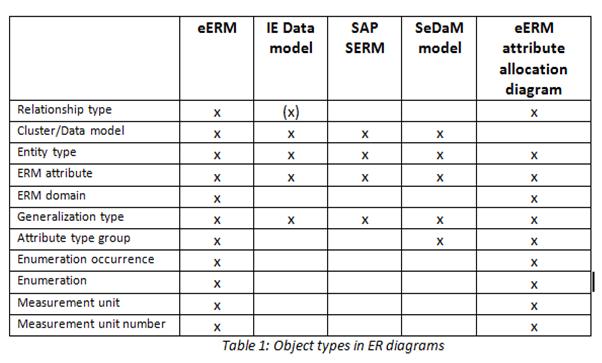
Figure 7. The example of tables
b) Pie charts
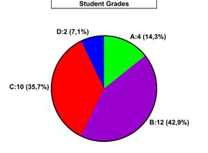
Figure 8. The example of pie chart
Statistics that are reported in percentages are often presented in what is called a pie chart, in which the complete "pie" represents 100 percent.
The distinctions can be heightened by shading or colouring the different segments of the pie (Fig. 8).
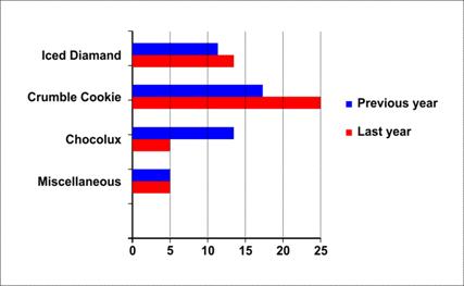
c) Bar charts
Horizontal bars
|
Figure 9. The example of horizontal bars
Another way of expressing data visually is by means of bar charts. To show data in the form of bar charts, the bar charts are drawn to scale and measured from the base line which may be horizontal (Fig. 9) or perpendicular.