Figure 10. The example of perpendicular bars
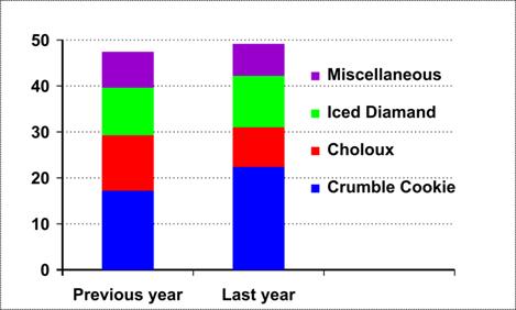
The perpendicular bar chart is also a "composite" bar chart because it includes a breakdown of the individual products in each bar (Fig. 10).
d) Gantt charts
A variation of the bar chart is the Gantt chart, used in connection with
the process of control in a business. It gives an instant visual comparison between expected and actual performance.
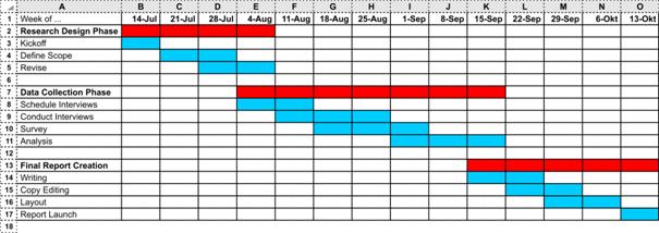
Figure 11. The example of a Gantt chart
e) Graphs
The most common form of visual presentation is the graph. Graphs are two-dimensional. The x -axis records one dimension, usually the time dimension. The y -axis records another range of data which changes in relation to the time (or other) series.
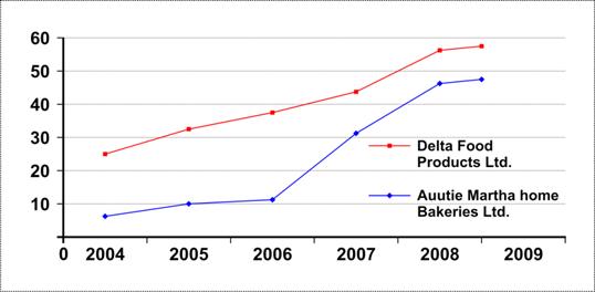
Figure 12. The example of a graph
The benefit of all these diagrammatic representations is that they present the data in an easily assimilable form. Those who are involved in the business need to be able to interpret data presented to them in whatever form.
f)A mind map is a diagram used to visually outline information. A mind map is often created around a single word or text, placed in the center, to which associated ideas, words and concepts are added. Major categories radiate from a central node, and lesser categories are sub-branches of larger branches. Categories can represent words, ideas, tasks, or other items related to a central key word or idea.
Mind maps can be drawn by hand, either as "rough notes" during a lecture or meeting, for example, or as higher quality pictures when more time is available. An example of a rough mind map is illustrated (Fig. 13).
Mind maps are considered to be a type of spider diagram. A similar concept in the 1970s was "idea sun bursting".
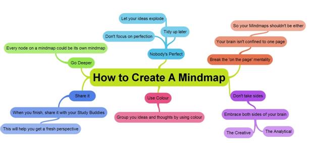
Figure 13. The example of a mind map
g)A flow chart is a type of diagram that represents an algorithm or process, showing the steps as boxes of various kinds, and their order by connecting them with arrows. This diagrammatic knowledge representation and reasoning representation shows a solution to a given problem. Process operations are represented in these boxes, and arrows; rather, they are implied by the sequencing of operations. Flow charts are used in analyzing, designing, documenting or managing a process or programme in various fields.
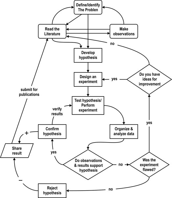
Figure 13. The example of a flow chart for "scientific method"

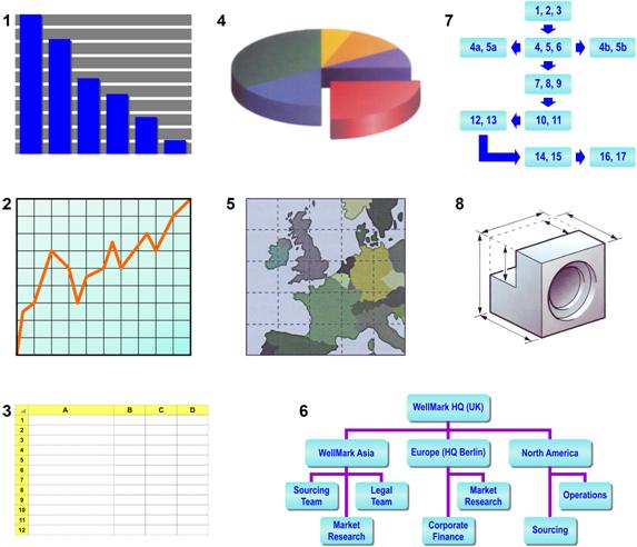
| Exercise 2. a) What are these visuals called in English? Match the number of the visual to its description in the text above. b) Which of these visuals would you use in your research work? |

| Exercise 3. These verbs are used to describe movement or trends. Put them in the correct category: |
climb, decline, decrease, double, drop, expand, fall, fluctuate, go down, go up, grow, hit a low, increase, pick up, plunge, reach a high, recover, remain stable, rise, stabilize, stay the same.
| Upward | Downward | Other |
|
| Exercise 4. Match the two parts to make sentences used to talk about visuals. |
| 1. Let's now have a look | a) shows our revenues since 2012. |
| 2. The black line gives us | b) the next pie chart. |
| 3. Each line on the graph indicates | c) at how the new division will be structured. |
| 4. In the upper right-hand corner | d) attention to the figures in the left-hand column. |
| 5. The graph on the following slide | e) you can see the specifications for the TP model. |
| 6. Now I'd like you to take | f) the sales figures for the VW Fox. |
| 7. The names of the new models are listed | g) table on the right. |
| 8. You can see the test results in | h) a look at the next slide. |
| 9. This aspect of the problem is illustrated in | i) the production output of a different product. |
| 10. I'd like to draw you | i) across the top. |

| Exercise 5. a) These expressions highlight important information in a visual. Complete them using the following words. |
| · on · to · at · out · about |
| us to look | 1…this part of the graph in more detail. | |
| us to focus our attention | 2… one particularly important feature. | |
| I'd like | you to think | 3…the significance of this figure here. |
| to point | 4… one or two interesting details. | |
| to draw your attention | 5… the upper half of the chart. |
b) These expressions comment on important information in a visual. Complete them using the following words:
| · If · As · Whatever · Whichever · However |
| 1. … you can see, there are several surprising developments. |
| 2. … you look at it more closely, you'll notice a couple of apparent anomalies. |
| 3. … you try to explain it, this is very bad news. |
| 4. … the reasons for this, the underlying trend is obvious. |
| 5. … way you look at it, these are some of our best results ever. |
|
| Exercise 6. Put the words in the right order to make sentences with expressions from this unit. |
1. chart percentage our of pie share the the market shows;
2. travel 2006 according costs since risen the have sharply to study;
3. rates 0.5 % beginning year the the interest were of raised by at;
4. June rise in dramatic 15 % in was there costs transport a of;
5. low December our in hit a productivity;
6. decline by poor situation the economic the was caused.
|
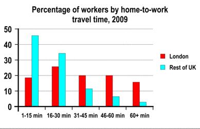
| Exercise 7. The graphs below give information about commuting inside and outside London in 2009. Summarise the information by selecting and reporting the main features, and make comparisons where relevant. |