4.1 Материалы, необходимые для выполнения задания (при необходимости)
RULES OF MAKING POSTERS
A poster is simply a static, visual medium. It is used to communicate ideas and message to a large audience. The important thing to remember is that the poster does most of the ‘talking for you’. That is, if designed properly, it will carry the message without the need to explain what is on it.
1.  Design
Let's have a look at the basic design concepts for poster presentations.
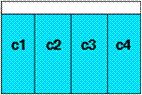 Always find out exactly how much space you have been allocated then divide this space up into sections. Columns work best. It's the same idea that makes newspapers easy to read. However, keep it simple – 3-5 columns:
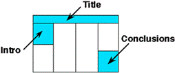
Place all the elements of the poster in position.
The title is across the top. A brief introduction (3 - 5 sentences) is at the upper left. The conclusions are at the lower right.
Title Banner should contain:
The title of the work.
The author’s name.
The institutional affiliations
The title banner should be readable from 5 m away.
6. Text
Your title should attract viewers closer to see your creative and imaginative project.
The rest of the title banner, and the body of the poster, should be legible from a distance of about 1.5m to 2m.
Text – Fonts
Choose one font - use it throughout the poster.
Use no more than two fonts in the whole poster.
Use large fonts for section headings.
Use smaller fonts for supporting text.
One option to consider is to use: a larger size (36pt) for the Conclusion text, a smaller size (18 pt) for Methods or other text.
Add emphasis by using boldface, underlining, or color
- italics are difficult to read from a distance.
If you must include narrative details, keep them brief.
8. Colours
Use colours sparingly and with taste:
· Use colours only to emphasise, differentiate and to add interest.
· Do not use colours just to impress!
· Do not use large swathes of bright garish colours like bright purple or pink.
Use:
· a light background with darker photos a dark background with lighter photos;
· a neutral background (gray) to emphasize colour in photos;
· a white background to reduce the impact of coloured photos.
9. Content
Keep the material simple:
· Make full use of the space, but do not cram a page full of information.
· Be concise and do not waffle – use only relevant information.
· Be selective with the results. Use only the main findings. Keep all other results handy to refer to them when asked. You may want to prepare handouts to give to people who are interested.
Sequencing the material
The poster should use photos, figures, and tables to tell the story of the study. Remember:
· A picture is worth a thousand words … but only if it is drawn/scanned properly and used appropriately.
· It is important to present the information in a sequence which is easy to follow: determine a logical sequence for the material you will be presenting.
· Organize that material into sections (Introduction, Method, Results, Conclusions, Business Plan, etc.).
· Use LARGE numbers to help sequence sections of the poster.
· Arrange the material into columns.
11. Illustrations
The success of a poster directly relates to the clarity of the illustrations and tables.
· Self-explanatory graphics should dominate the poster.
· All figures and graphs should be clearly labelled.
· Graphic materials should be supplemented by minimal amount of text.
· Remove all non-essential information from graphs and tables.
· Use empty space between poster elements to differentiate and accentuate the elements in the poster.
· Graphic materials should be visible easily from at least 1.5 metres away.
WARNING:
Artful illustrations, luminous colours, or fantastic computer-rendered drawings are NOT substitutes for CONTENT.
12. Edit
There is ALWAYS too much text in a poster. Look critically at the layout. Posters primarily are visual presentations; the text materials serve to support the graphic materials.
Ask yourself: Is there about 20% text, 40% graphics and 40% empty space?
No? Then CUT CUT CUT!
13. Language
Words are at a premium. That is, you should use the least amount of words as possible. Therefore, language must be:
· Concise - Get to the point quickly. Use short sentences.
· Clear - Make sure the meaning is made clear.
How to make a poster